Burning Man - 2006
Button Images
In 2006, due to budgetary reasons I could not create the art project I initially wanted. I had no inspiration regarding anything molded, so I decided to make a set of buttons to hand out.
I had fun making the artwork for these, and making them was a snap.
I handed several hundred of these.
Here is the artwork for each of them. Bear in mind, the art work extends beyone the actual diameter of the button so the wrap effect is nice.

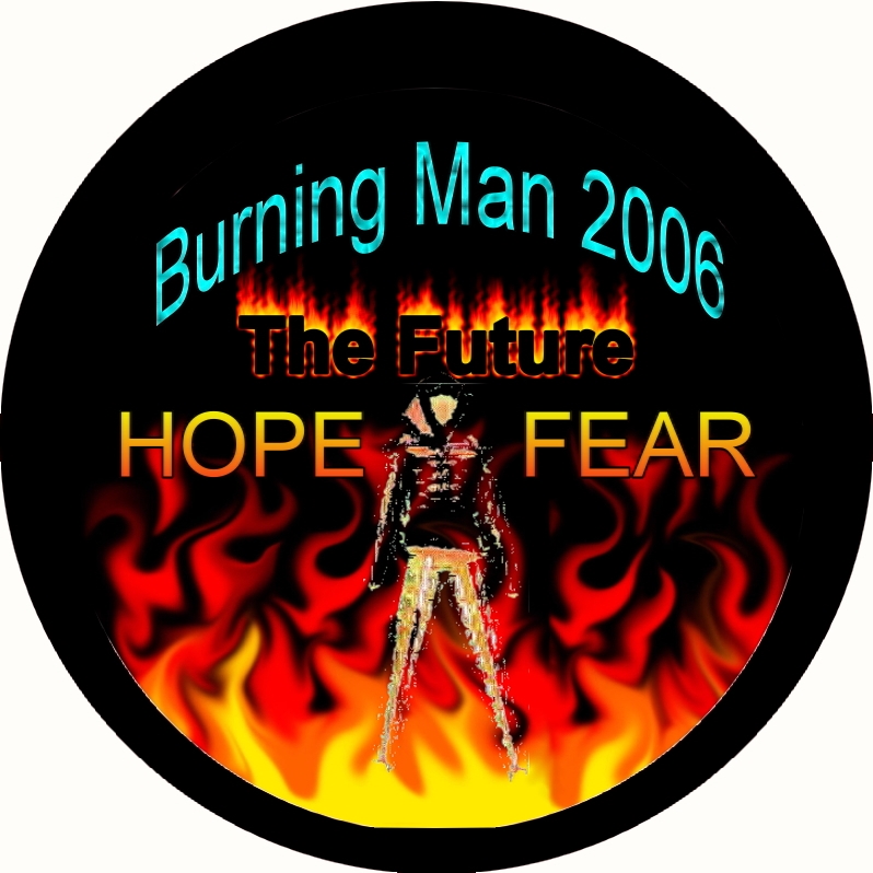
The FLAME button. I liked this one because I doctored the picture of the man so that it looked kind of ghostly. As if he was already being consumed by the flames.
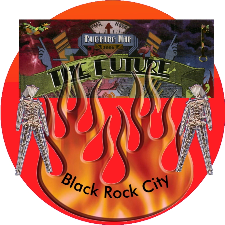
The Red Button - That is a copy of the ticket at the top of the button.
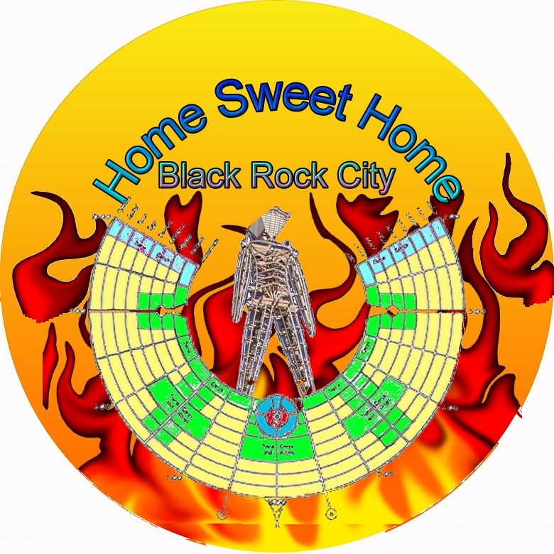
The "Home Sweet Home" Button - This one seemed to be the most popular. I may use the design again this year. The Green area of the BRC Map is where all the theme camps were placed. The light blue at the end is the "noisy" end of the city.
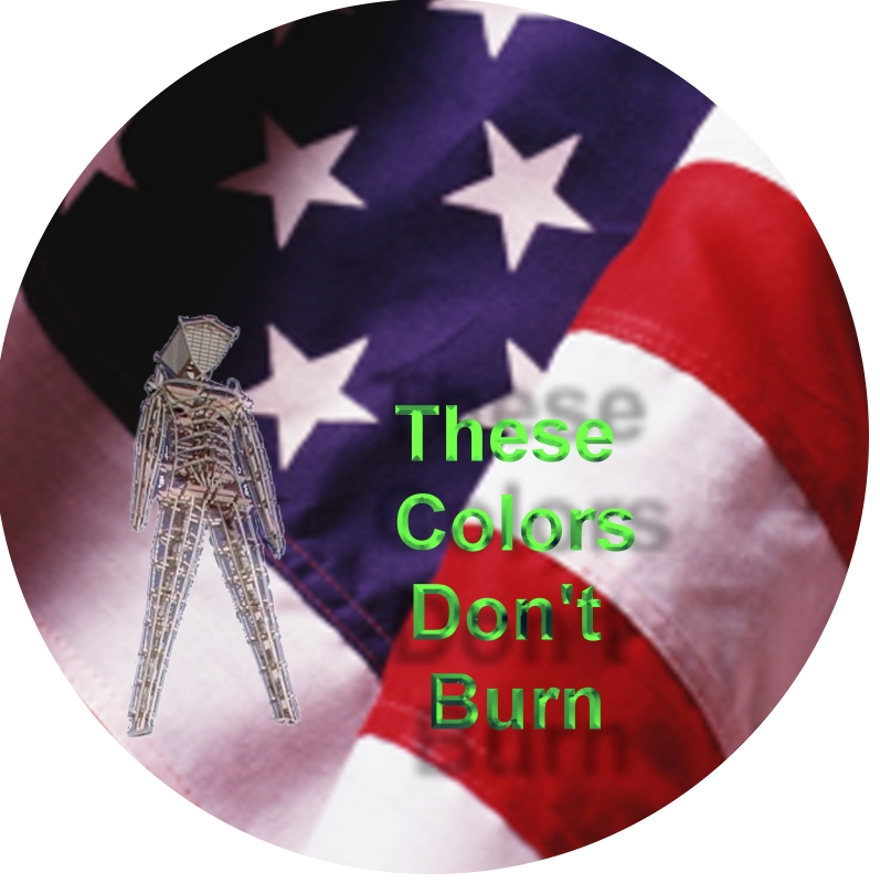
This final design was given to Law Enforcement only. Someone had made a disparaging remark about the law enforcement presence at Burning Man. I figured these guys needed to be thanked in some way or other. I liked the design because from a distance it just looks like something patriotic. It's only up close that you see the Man and the less jingoistic turn of a comman phrase.
It was fun seeing some officers wander through Center Camp when I was at the Complaint Desk and notice that they were wearing my button. Sweet.